The Bad

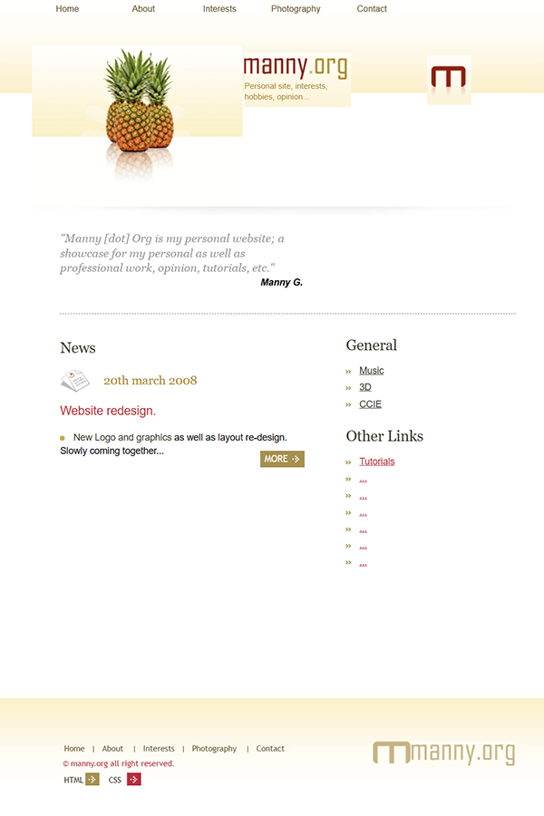
The previous iteration of the website had grown stagnant, having remained virtually unchanged for well over a decade. Recognizing the need for a breath of fresh air, I embarked on a journey to revitalize its essence. The decision to initiate a makeover was fueled by a desire to infuse modernity, enhance functionality, and prioritize user-friendliness.
The first step in this transformation involved a fundamental shift in the website’s backbone, transitioning to the versatile platform of WordPress. This strategic move not only modernized the site but also laid the groundwork for future adaptability and seamless updates.
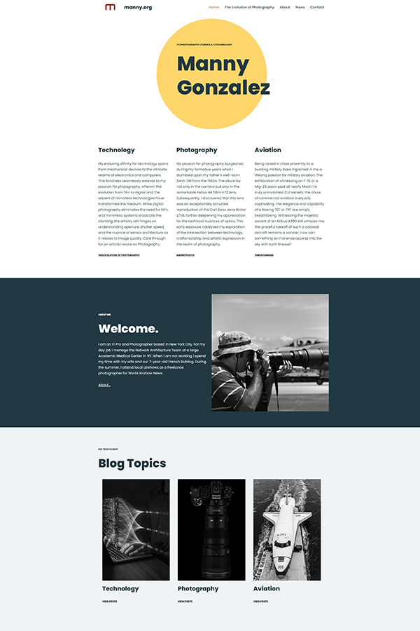
The visual facelift commenced with a meticulous overhaul of the website’s aesthetics. Typography, color themes, and layout received a contemporary touch, breathing new life into the virtual space. The intention was to create an environment that resonated with current design trends while maintaining a harmonious and visually appealing interface.
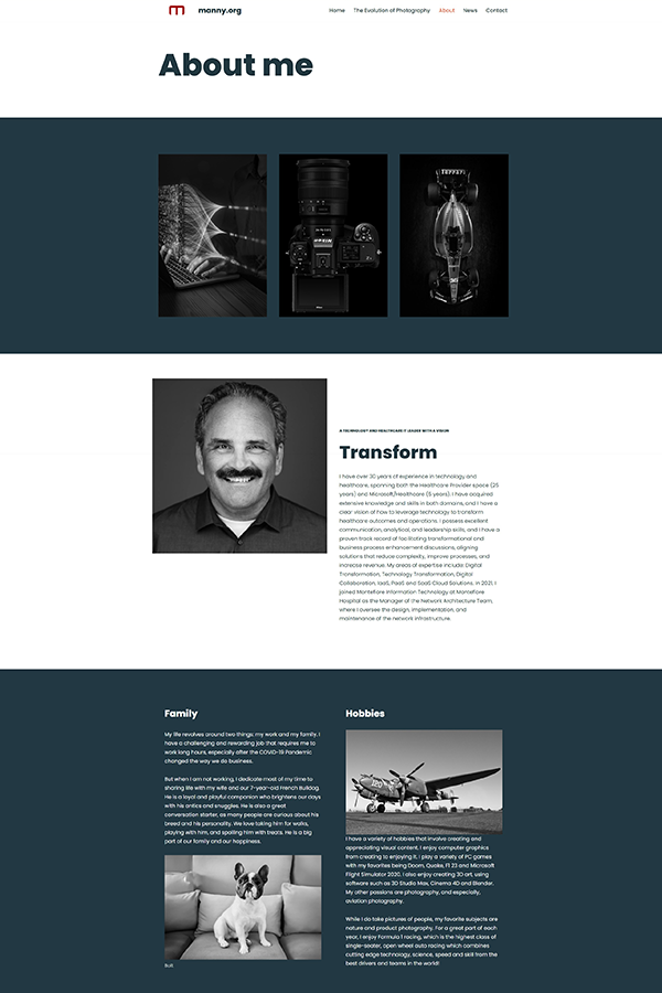
Adding a personal touch became a focal point of the makeover. More personal details were integrated, fostering a sense of connection and relatability for visitors. The revival of a blog section injected fresh, dynamic content, providing a platform for sharing thoughts, experiences, and updates.
Navigation underwent a significant improvement to enhance the overall user experience. Intuitive pathways were crafted to guide visitors seamlessly through the site, ensuring a fluid and engaging journey. Content, too, received a thorough refresh, aligning it with the latest trends and ensuring relevance and value for the audience.
A paramount consideration in the redesign was the responsiveness and accessibility of the site. The revamped platform was meticulously designed to adapt gracefully to various devices, from desktops to smartphones, ensuring a consistent and enjoyable experience for users across the digital spectrum.
In essence, the transformation of the website was not merely a surface-level makeover; it was a comprehensive revitalization aimed at ushering it into a new era of relevance and functionality. The culmination of these efforts resulted in a modern, user-friendly, and aesthetically pleasing digital space that mirrors the contemporary web landscape.
The Ugly

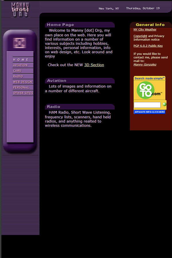
The initial site design, birthed in the bygone era of the last century, was, in retrospect, a design disaster. In its infancy, it stood as a proud testament to the digital landscape of the time. However, as the years progressed, and technology evolved, the once-celebrated design morphed into a source of dissatisfaction. By the mid-2000s, it had become a visual relic, a virtual representation frozen in time that now invoked a sense of dismay.
Recognizing the urgent need for a transformation, I undertook a significant overhaul in 2015. The primary goal was to shed the remnants of the past and embrace a contemporary design philosophy. The first order of business was to modernize the layout and user interface (UI). The design was stripped of the outdated elements, and almost 99% of the lingering 3D styling, reminiscent of the internet’s early days, was systematically removed. This shift represented a conscious departure from trends that had long lost their relevance in the rapidly evolving digital landscape.
Despite these substantial improvements, a critical flaw persisted – the website’s utility had been inadvertently diminished. The redesigned site now functioned as a mere landing page, redirecting visitors to another page with links to my LinkedIn and photography sites. This reduction in functionality and engagement was deemed unacceptable.
Recognizing this shortfall, I embarked on a subsequent phase of redevelopment. The objective was to restore the website’s purpose and utility, ensuring it served as a dynamic hub rather than a mere redirection point. The landing page was reconceptualized to offer a meaningful and interactive experience, providing visitors with valuable content and resources directly on the homepage.
The evolution of the site was not just a visual upgrade; it was a strategic reimagining of its purpose and functionality. The journey from a dated design catastrophe to a modern, functional digital space was marked by deliberate choices, continuous refinement, and a commitment to providing a valuable online experience for visitors. The end result aimed not only to rectify past missteps but to position the site as a relevant and engaging platform in the present digital landscape.
The Good

The outcome of the redesign left me genuinely elated. The new site, unveiled after meticulous planning and creative effort, radiated a sense of freshness, vitality, and warmth that was distinctly inviting. It was a digital embodiment of my personality and a visual realization of the vision I had envisioned for my online presence. The transformation was akin to a breath of fresh air, infusing life and energy into the virtual space.
The aesthetic overhaul not only met but exceeded my expectations. The visual elements were carefully curated to align seamlessly with my personal brand, creating an online environment that felt authentic and resonant. The liveliness of the design conveyed a sense of dynamism, mirroring the evolving nature of my interests and endeavors.
The vibrancy of the new site was more than skin deep; it extended to the core of its functionality and user experience. Navigating through the pages felt intuitive, and the interactive elements added a layer of engagement that was missing in the previous iteration. The site was not just a digital placeholder; it had become a curated experience for visitors, inviting them to explore and connect.

In essence, the joy derived from the result went beyond the surface aesthetics. It was a satisfaction rooted in the realization that the redesigned site was not merely a visual upgrade but a tangible manifestation of my digital identity. It stood as a testament to the creative journey undertaken to align the virtual space with my personality and aspirations.
As I navigated through the newly revamped site, the feeling of contentment was palpable. It was not just a static digital entity; it had become an extension of myself, a dynamic representation of who I am and what I stand for. The digital breath of fresh air had not only revitalized the website but had also breathed new life into my online presence.